Contribute to help us improve!
Are there edge cases or problems that we didn't consider? Is there a technical pitfall that we should add? Did we miss a comma in a sentence?
If you have any input for us, we would love to hear from you and appreciate every contribution. Our goal is to learn from projects for projects such that nobody has to reinvent the wheel.
Let's collect our experiences together to make room to explore the novel!
To contribute click on Contribute to this page on the toolbar.
Angular Material Layout
The purpose of this guide is to get a basic understanding of creating layouts using Angular Material in a devon4ng application. We will create an application with a header containing some menu links and a sidenav with some navigation links.
Create a new angular application
We start with opening the devonfw IDE(right-click anywhere in your workspace and click "Open devonfw CMD shell here") and running the following command to start a project named devon4ng-mat-layout
-
ng new devon4ng-mat-layout --routing --style=scss. If you are using Nx, the command would benx generate @nrwl/angular:app devon4ng-mat-layout --routing --style=scssin your Nx workspace. Click here to get started with using Nx.
We are providing the routing flag so that a routing module is generated, and we are also setting the style sheet format to SCSS with --style=scss.
Once the creation process is complete, open your newly created application in Visual Studio Code. Try running the empty application by running the following command in the integrated terminal:
-
ng serve. (If you are using Nx, you have to specify the project name along with the --project flag, so the command becomesng serve --project=devon4ng-mat-layout)
Angular will spin up a server and you can check your application by visiting http://localhost:4200/ in your browser.
Adding Angular Material library to the project
Next we will add Angular Material to our application. In the integrated terminal, press Ctrl + C to terminate the running application and run the following command:
-
npm install --save @angular/material @angular/cdk @angular/animations
You can also use Yarn to install the dependencies if you prefer that:
-
yarn add @angular/material @angular/cdk @angular/animations
Once the dependencies are installed, we need to import the BrowserAnimationsModule in our AppModule for animations support.
BrowserAnimationsModule in AppModuleimport {BrowserAnimationsModule} from '@angular/platform-browser/animations';
@NgModule({
...
imports: [BrowserAnimationsModule],
...
})
export class AppModule { }Angular Material provides a host of components for designing our application. All the components are well structured into individual NgModules. For each component from the Angular Material library that we want to use, we have to import the respective NgModule.
import { MatIconModule, MatButtonModule, MatMenuModule, MatListModule, MatToolbarModule, MatSidenavModule } from '@angular/material';

@NgModule({
  ...
  imports: [
	...
    MatIconModule,
    MatButtonModule,
    MatMenuModule,
    MatListModule,
    MatToolbarModule,
    MatSidenavModule,
	...
	],
  ...
})
export class AppModule { }
A better approach is to import and then export all the required components in a shared module. But for the sake of simplicity, we are importing all the required components in the AppModule itself.
You can find a working copy of this application https://github.com/devonfw-sample/devon4ts-samples/tree/master/apps/angular-material-basic-layout[here]. The sample application is part of a Nx workspace, which means it is one of the many apps in a monorepo and capable of importing reusable code from a shared library. This guide describes the implementaion by assuming a stand-alone single-repo application, but the pages and layout described in this sample app are similar to the ones used in another sample app in the monorepo (https://github.com/devonfw-sample/devon4ts-samples/tree/master/apps/angular-material-theming[angular-material-theming]), which is why we have exported the required components from a shared library and reused them in both the apps. As a result, the code in our monorepo will be slightly different. It would still help you in following this guide. |
Next, we include a theme in our application. Angular Material comes with four pre-defined themes: indigo-pink, deeppurple-amber, pink-bluegrey and purple-green. It is also possible to create our own custom theme, but that is beyond the scope of this guide. Including a theme is required to apply all of the core and theme styles to your application.
We will include the indigo-pink theme in our application by importing the indigo-pink.css file in our src/styles.scss:
src/styles.scss:@import "~@angular/material/prebuilt-themes/indigo-pink.css";To use Material Design Icons along with the mat-icon component, we will load the Material Icons library in our src/index.html file
<link href="https://fonts.googleapis.com/icon?family=Material+Icons" rel="stylesheet">Development
Now that we have all the Angular Material related dependencies set up in our project, we can start coding. Let’s begin by adding a suitable margin and font to the body element of our single page application. We will add it in the src/styles.scss file to apply it globally:
src/styles.scss:body {
margin: 0;
font-family: "Segoe UI", Roboto, sans-serif;
}At this point, if we run our application, this is how it will look like:
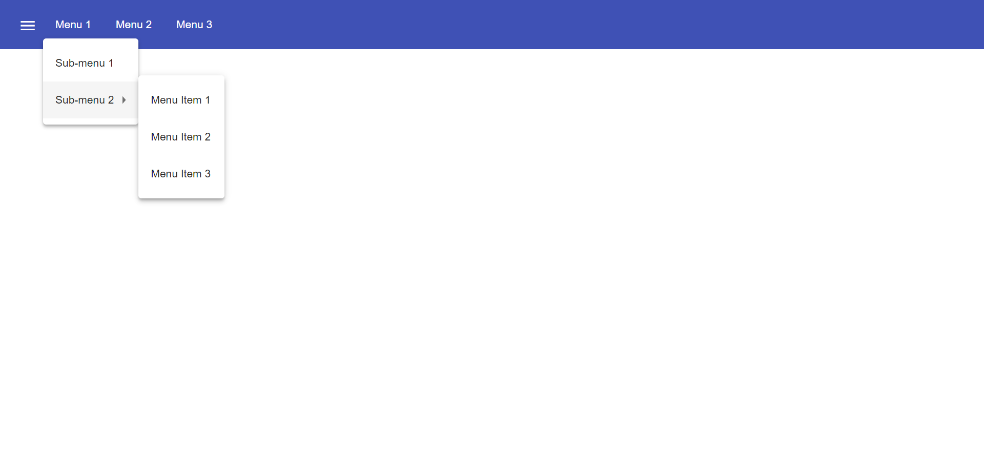
We will clear the app.component.html file and setup a header with a menu button and some navigational links. We will use mat-toolbar, mat-button, mat-menu, mat-icon and mat-icon-button for this:
<mat-toolbar color="primary">
  <button mat-icon-button aria-label="menu">
    <mat-icon>menu</mat-icon>
  </button>
  <button mat-button [matMenuTriggerFor]="submenu">Menu 1</button>
  <button mat-button>Menu 2</button>
  <button mat-button>Menu 3</button>

  <mat-menu #submenu="matMenu">
    <button mat-menu-item>Sub-menu 1</button>
    <button mat-menu-item [matMenuTriggerFor]="submenu2">Sub-menu 2</button>
  </mat-menu>

  <mat-menu #submenu2="matMenu">
    <button mat-menu-item>Menu Item 1</button>
    <button mat-menu-item>Menu Item 2</button>
    <button mat-menu-item>Menu Item 3</button>
  </mat-menu>

</mat-toolbar>
The color attribute on the mat-toolbar element will give it the primary (indigo) color as defined by our theme. The color attribute works with most Angular Material components; the possible values are 'primary', 'accent' and 'warn'.
The mat-toolbar is a suitable component to represent a header. It serves as a placeholder for elements we want in our header.
Inside the mat-toolbar, we start with a button having mat-icon-button attribute, which itself contains a mat-icon element having the value menu. This will serve as a menu button which we can use to toggle the sidenav.
We follow it with some sample buttons having the mat-button attribute. Notice the first button has a property matMenuTriggerFor bound to a local reference submenu. As the property name suggests, the click of this button will display the mat-menu element with the specified local reference as a drop-down menu. The rest of the code is self explanatory.
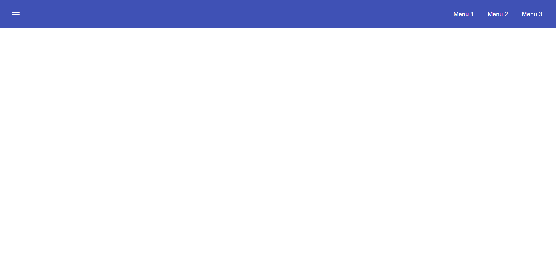
We want to keep the sidenav toggling menu button on the left and move the rest to the right to make it look better. To do this we add a class to the menu icon button:
...
  <button mat-icon-button aria-label="menu" class="menu">
    <mat-icon>menu</mat-icon>
  </button>
...
And in the app.component.scss file, we add the following style:
app.component.scss:.menu {
margin-right: auto;
}The mat-toolbar element already has it’s display property set to flex. Setting the menu icon button’s margin-right property to auto keeps itself on the left and pushes the other elements to the right.
Next, we will create a sidenav. But before that lets create a couple of components to navigate between, the links of which we will add to the sidenav.
We will use the ng generate component (or ng g c command for short) to create Home and Data components. (Append --project=devon4ng-mat-layout to the command in a Nx workspace). We nest them in the pages sub-directory since they represent our pages.
-
ng g c pages/home -
ng g c pages/data;
Let us set up the routing such that when we visit http://localhost:4200/ root url we see the HomeComponent and when we visit http://localhost:4200/data url we see the DataComponent.
We had opted for routing while creating the application, so we have the routing module app-routing.module.ts setup for us. In this file, we have the empty routes array where we set up our routes.
import { HomeComponent } from './pages/home/home.component';
import { DataComponent } from './pages/data/data.component';

	const routes: Routes = [
	  { path: '', component: HomeComponent },
	  { path: 'data', component: DataComponent }
	];
We need to provide a hook where the components will be loaded when their respective URLs are loaded. We do that by using the router-outlet directive in the app.component.html.
...
	</mat-toolbar>
	<router-outlet></router-outlet>
Now when we visit the defined URLs we see the appropriate components rendered on screen.
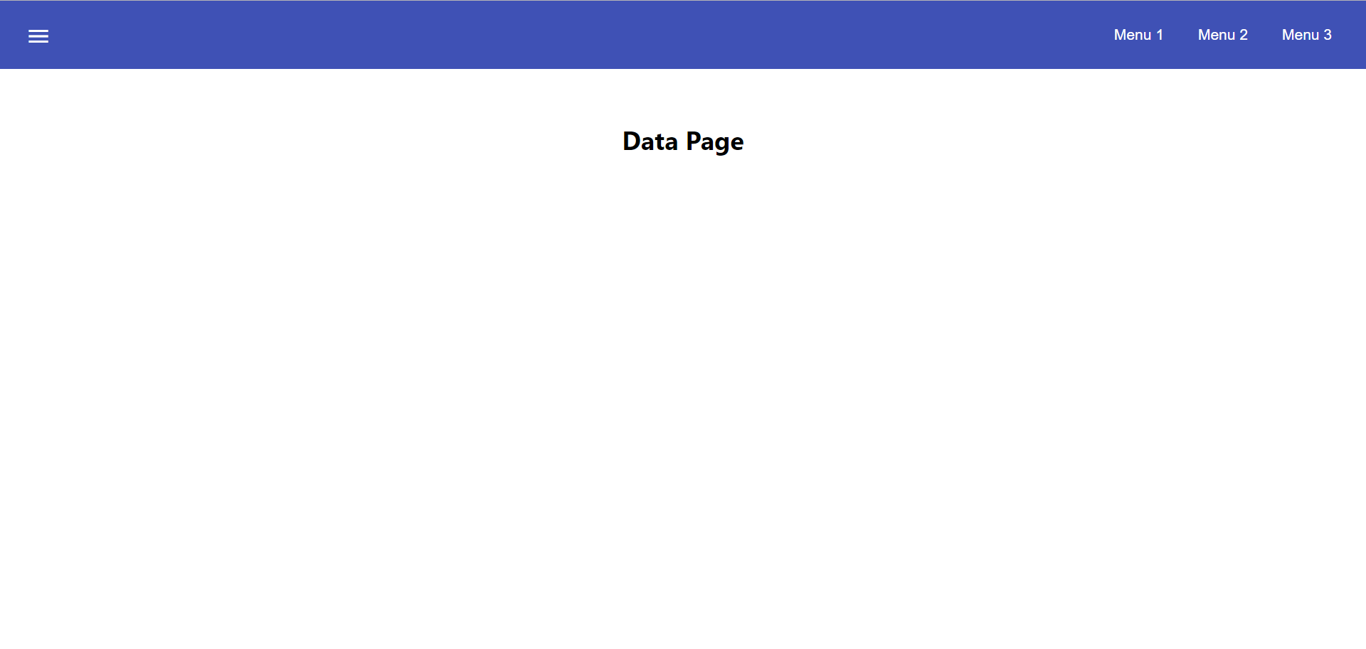
Lets change the contents of the components to have something better.
<h2>Home Page</h2>home.component.scss:h2 {
text-align: center;
margin-top: 50px;
}<h2>Data Page</h2>data.component.scss:h2 {
text-align: center;
margin-top: 50px;
}The pages look somewhat better now:
Let us finally create the sidenav. To implement the sidenav we need to use 3 Angular Material components: mat-sidenav-container, mat-sidenav and mat-sidenav-content.
The mat-sidenav-container, as the name suggests, acts as a container for the sidenav and the associated content. So it is the parent element, and mat-sidenav and mat-sidenav-content are the children sibling elements. mat-sidenav represents the sidenav. We can put any content we want, though it is usually used to contain a list of navigational links. The mat-sidenav-content element is for containing the contents of our current page. Since we need the sidenav application-wide, we will put it in the app.component.html.
...
</mat-toolbar>

<mat-sidenav-container>
  <mat-sidenav mode="over" [disableClose]="false" #sidenav>
    Sidenav
  </mat-sidenav>
  <mat-sidenav-content>
    <router-outlet></router-outlet>
  </mat-sidenav-content>
</mat-sidenav-container>
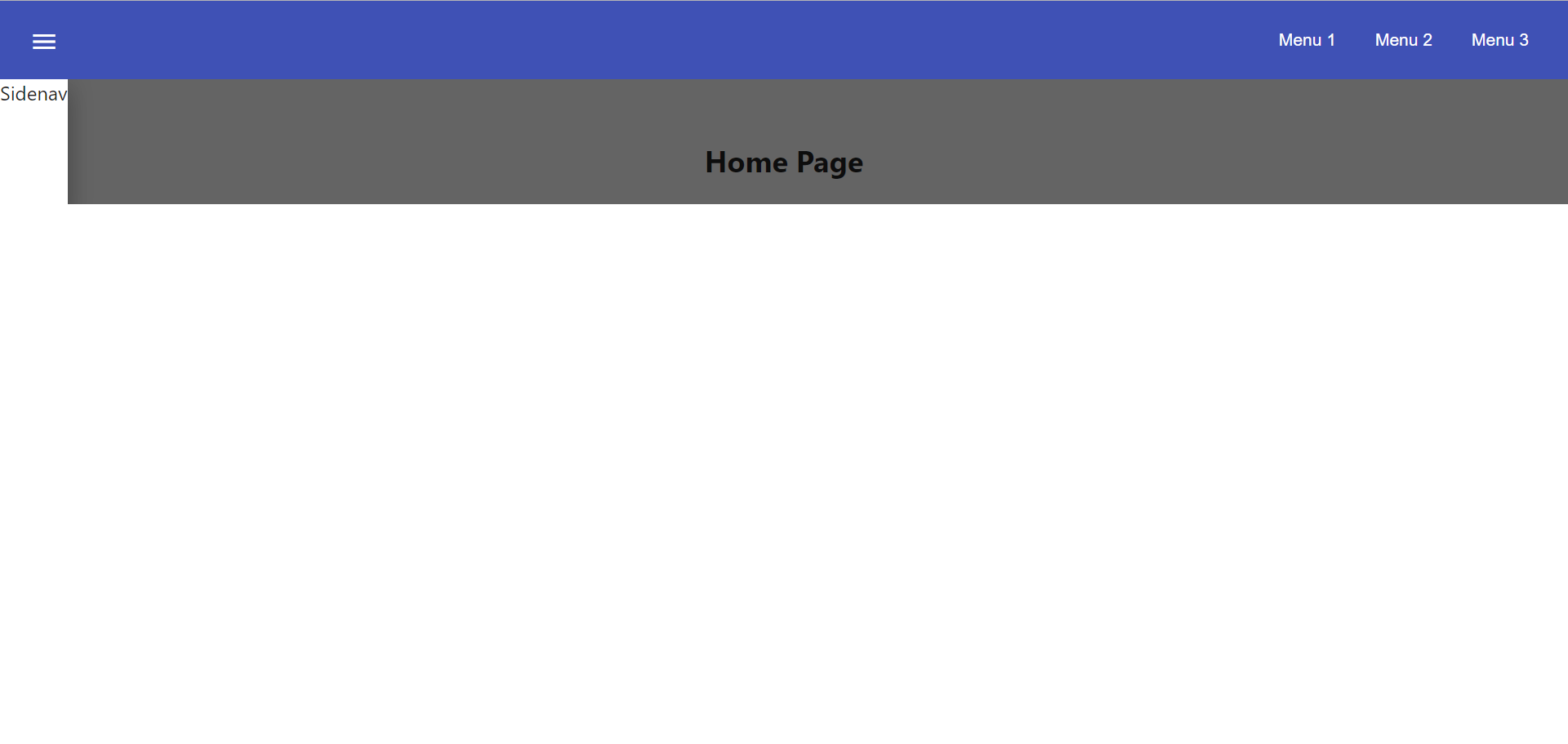
The mat-sidenav has a mode property, which accepts one of the 3 values: over, push and side. It decides the behavior of the sidenav. mat-sidenav also has a disableClose property which accents a boolean value. It toggles the behavior where we click on the backdrop or press the Esc key to close the sidenav. There are other properties which we can use to customize the appearance, behavior and position of the sidenav. You can find the properties documented online at https://material.angular.io/components/sidenav/api
We moved the router-outlet directive inside the mat-sidenav-content where it will render the routed component.
But if you check the running application in the browser, we don’t see the sidenav yet. That is because it is closed. We want to have the sidenav opened/closed at the click of the menu icon button on the left side of the header we implemented earlier. Notice we have set a local reference #sidenav on the mat-sidenav element. We can access this element and call its toggle() function to toggle open or close the sidenav.
...
  <button mat-icon-button aria-label="menu" class="menu" (click)="sidenav.toggle()">
    <mat-icon>menu</mat-icon>
  </button>
...We can now open the sidenav by clicking the menu icon button. But it does not look right. The sidenav is only as wide as its content. Also the page does not stretch the entire viewport due to lack of content. Let’s add the following styles to make the page fill the viewport:
...
mat-sidenav-container {
    position: absolute;
    top: 64px;
    left: 0;
    right: 0;
    bottom: 0;
}
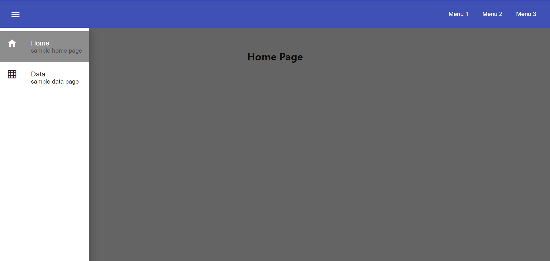
The sidenav width will be corrected when we add the navigational links to it. That is the only thing remaining to be done. Lets implement it now:
...
  <mat-sidenav [disableClose]="false" mode="over" #sidenav>
	<mat-nav-list>
      <a
        id="home"
        mat-list-item
        [routerLink]="['./']"
        (click)="sidenav.close()"
        routerLinkActive="active"
        [routerLinkActiveOptions]="{exact: true}"
      >
        <mat-icon matListAvatar>home</mat-icon>
        <h3 matLine>Home</h3>
        <p matLine>sample home page</p>
      </a>
      <a
        id="sampleData"
        mat-list-item
        [routerLink]="['./data']"
        (click)="sidenav.close()"
        routerLinkActive="active"
      >
        <mat-icon matListAvatar>grid_on</mat-icon>
        <h3 matLine>Data</h3>
        <p matLine>sample data page</p>
      </a>
    </mat-nav-list>
  </mat-sidenav>
...
We use the mat-nav-list element to set a list of navigational links. We use the a tags with mat-list-item directive. We implement a click listener on each link to close the sidenav when it is clicked. The routerLink directive is used to provide the URLs to navigate to. The routerLinkActive directive is used to provide the class name which will be added to the link when it’s URL is visited. Here we name the class`active`. To style it, let' modify the app.component.scss file:
app.component.scss:...
mat-sidenav-container {
...
a.active {
background: #8e8d8d;
color: #fff;
p {
color: #4a4a4a;
}
}
}Now we have a working application with a basic layout: a header with some menu and a sidenav with some navigational links.
Conclusion
The purpose of this guide was to provide a basic understanding of creating layouts with Angular Material. The Angular Material library has a huge collection of ready to use components which can be found at https://material.angular.io/components/categories It has provided documentation and example usage for each of its components. Going through the documentation will give a better understanding of using Angular Material components in our devon4ng applications.

