Contribute to help us improve!
Are there edge cases or problems that we didn't consider? Is there a technical pitfall that we should add? Did we miss a comma in a sentence?
If you have any input for us, we would love to hear from you and appreciate every contribution. Our goal is to learn from projects for projects such that nobody has to reinvent the wheel.
Let's collect our experiences together to make room to explore the novel!
To contribute click on Contribute to this page on the toolbar.
Angular Material Theming
Angular Material library offers UI components for developers, those components follows Google Material design baselines but characteristics like colors can be modified in order to adapt them to the needs of the client: corporative colors, corporative identity, dark themes, …
Theming basics
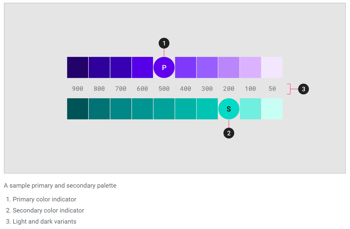
In Angular Material, a theme is created mixing multiple colors. Colors and its light and dark variants conform a palette. In general, a theme consists of the following palettes:
-
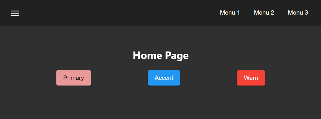
primary: Most used across screens and components.
-
accent: Floating action button and interactive elements.
-
warn: Error state.
-
foreground: Text and icons.
-
background: Element backgrounds.
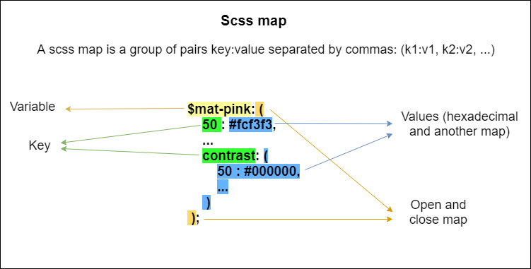
In angular material, a palette is represented as a SCSS map.
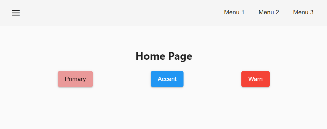
| Some components can be forced to use primary, accent or warn palettes using the attribute color, for example: <mat-toolbar color="primary">. |
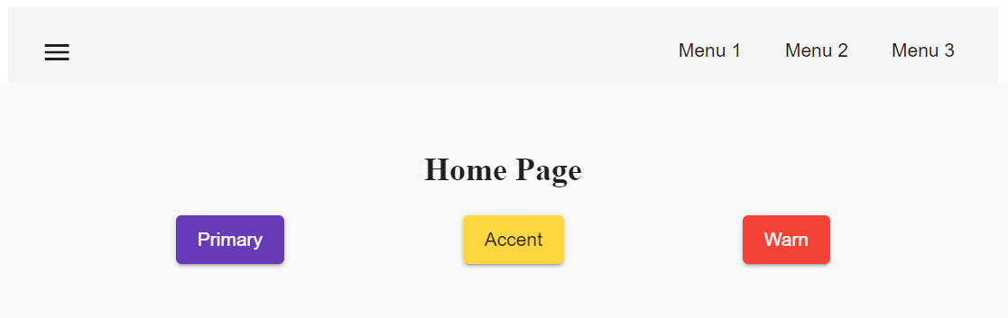
Pre-built themes
Available pre-built themes:
-
deeppurple-amber.css
deeppurple-amber theme.-
indigo-pink.css
-
pink-bluegrey.css
ink-bluegrey theme.-
purple-green.css
The pre-built themes can be added using @import.
@import '@angular/material/prebuilt-themes/deeppurple-amber.css';Custom themes
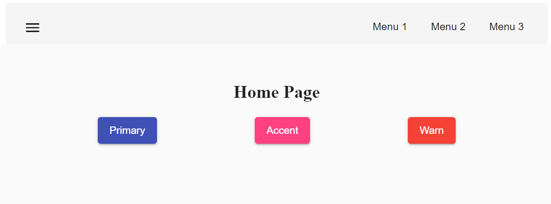
Sometimes pre-built themes do not meet the needs of a project, because color schemas are too specific or do not incorporate branding colors, in those situations custom themes can be built to offer a better solution to the client.
For this topic, we are going to use a basic layout project that can be found in devon4ts-samples repository.
Basics
Before starting writing custom themes, there are some necessary things that have to be mentioned:
-
Add a default theme: The project mentioned before has just one global SCSS style sheet
styles.scssthat includesindigo-pink.scsswhich will be the default theme. -
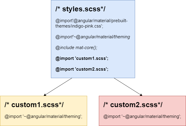
Add @import '~@angular/material/theming'; at the beginning of the every style sheet to be able to use angular material pre-built color palettes and functions.
-
Add @include mat-core(); once per project, so if you are writing multiple themes in multiple files you could import those files from a 'central' one (for example
styles.scss). This includes all common styles that are used by multiple components.
Basic custom theme
To create a new custom theme, the .scss file containing it has to have imported the angular _theming.scss file (angular/material/theming) file and mat-core included. _theming.scss includes multiple color palettes and some functions that we are going to see below. The file for this basic theme is going to be named styles-custom-dark.scss.
First, declare new variables for primary, accent and warn palettes. Those variables are going to store the result of the function mat-palette.
mat-palette accepts four arguments: base color palette, main, lighter and darker variants (See Palettes and variants.) and returns a new palette including some additional map values: default, lighter and darker ([id_scss_map]). Only the first argument is mandatory.
File styles-custom-dark.scss.$custom-dark-theme-primary: mat-palette($mat-pink);
$custom-dark-theme-accent: mat-palette($mat-blue);
$custom-dark-theme-warn: mat-palette($mat-red);
);In this example we are using colors available in _theming.scss: mat-pink, mat-blue, mat-red. If you want to use a custom color you need to define a new map, for instance:
styles-custom-dark.scss custom pink.$my-pink: (
50 : #fcf3f3,
100 : #f9e0e0,
200 : #f5cccc,
300 : #f0b8b8,
500 : #ea9999,
900 : #db6b6b,
A100 : #ffffff,
A200 : #ffffff,
A400 : #ffeaea,
A700 : #ffd0d0,
contrast: (
50 : #000000,
100 : #000000,
200 : #000000,
300 : #000000,
900 : #000000,
A100 : #000000,
A200 : #000000,
A400 : #000000,
A700 : #000000,
)
);
$custom-dark-theme-primary: mat-palette($my-pink);
...| Some pages allows to create these palettes easily, for instance: http://mcg.mbitson.com |
Until now, we just have defined primary, accent and warn palettes but what about foreground and background? Angular material has two functions to change both:
-
mat-light-theme: Receives as arguments primary, accent and warn palettes and return a theme whose foreground is basically black (texts, icons, …), the background is white and the other palettes are the received ones.
-
mat-dark-theme: Similar to mat-light-theme but returns a theme whose foreground is basically white and background black.
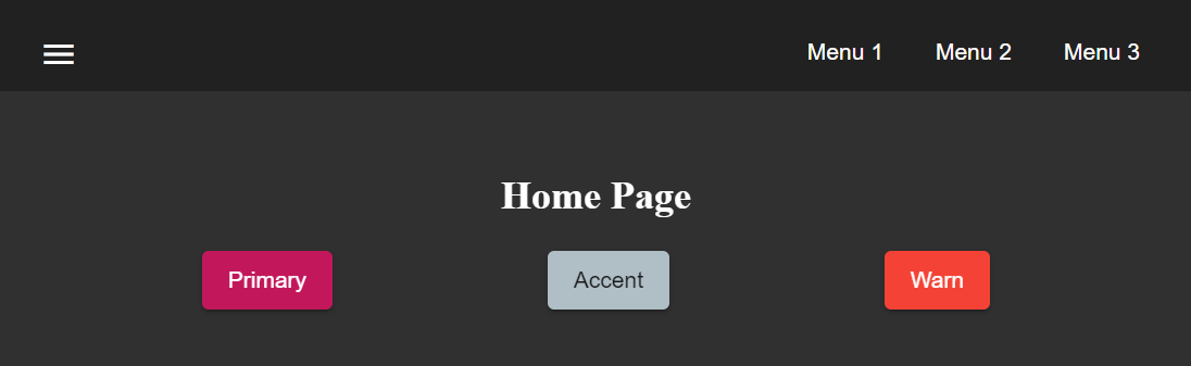
For this example we are going to use mat-dark-theme and save its result in $custom-dark-theme.
styles-custom-dark.scss updated with mat-dark-theme....
$custom-dark-theme: mat-dark-theme(
$custom-dark-theme-primary,
$custom-dark-theme-accent,
$custom-dark-theme-warn
);To apply the saved theme, we have to go to styles.scss and import our styles-custom-dark.scss and include a function called angular-material-theme using the theme variable as argument.
styles.scss....
@import 'styles-custom-dark.scss';
@include angular-material-theme($custom-dark-theme);If we have multiple themes it is necessary to add the include statement inside a css class and use it in src/index.html → app-root component.
styles.scss updated with custom-dark-theme class....
@import 'styles-custom-dark.scss';
.custom-dark-theme {
@include angular-material-theme($custom-dark-theme);
}src/index.html....
<app-root class="custom-dark-theme"></app-root>
...This will apply $custom-dark-theme theme for the entire application.
Full custom theme
Sometimes it is needed to custom different elements from background and foreground, in those situations we have to create a new function similar to mat-light-theme and mat-dark-theme. Let’s focus con mat-light-theme:
@function mat-light-theme($primary, $accent, $warn: mat-palette($mat-red)) {
  @return (
    primary: $primary,
    accent: $accent,
    warn: $warn,
    is-dark: false,
    foreground: $mat-light-theme-foreground,
    background: $mat-light-theme-background,
  );
}
As we can see, mat-light-theme takes three arguments and returns a map including them as primary, accent and warn color; but there are three more keys in that map: is-dark, foreground and background.
-
is-dark: Boolean true if it is a dark theme, false otherwise.
-
background: Map that stores the color for multiple background elements.
-
foreground: Map that stores the color for multiple foreground elements.
To show which elements can be colored lets create a new theme in a file styles-custom-cap.scss:
styles-custom-cap.scss: Background and foreground variables.@import '~@angular/material/theming';
// custom background and foreground palettes
$my-cap-theme-background: (
status-bar: #0070ad,
app-bar: map_get($mat-blue, 900),
background: #12abdb,
hover: rgba(white, 0.04),
card: map_get($mat-red, 800),
dialog: map_get($mat-grey, 800),
disabled-button: $white-12-opacity,
raised-button: map-get($mat-grey, 800),
focused-button: $white-6-opacity,
selected-button: map_get($mat-grey, 900),
selected-disabled-button: map_get($mat-grey, 800),
disabled-button-toggle: black,
unselected-chip: map_get($mat-grey, 700),
disabled-list-option: black,
);
$my-cap-theme-foreground: (
base: yellow,
divider: $white-12-opacity,
dividers: $white-12-opacity,
disabled: rgba(white, 0.3),
disabled-button: rgba(white, 0.3),
disabled-text: rgba(white, 0.3),
hint-text: rgba(white, 0.3),
secondary-text: rgba(white, 0.7),
icon: white,
icons: white,
text: white,
slider-min: white,
slider-off: rgba(white, 0.3),
slider-off-active: rgba(white, 0.3),
);Function which uses the variables defined before to create a new theme:
styles-custom-cap.scss: Creating a new theme function.// instead of creating a theme with mat-light-theme or mat-dark-theme,
// we will create our own theme-creating function that lets us apply our own foreground and background palettes.
@function create-my-cap-theme($primary, $accent, $warn: mat-palette($mat-red)) {
@return (
primary: $primary,
accent: $accent,
warn: $warn,
is-dark: false,
foreground: $my-cap-theme-foreground,
background: $my-cap-theme-background
);
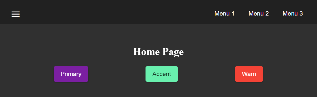
}Calling the new function and storing its value in $custom-cap-theme.
styles-custom-cap.scss: Storing the new theme.// We use create-my-cap-theme instead of mat-light-theme or mat-dark-theme
$custom-cap-theme-primary: mat-palette($mat-green);
$custom-cap-theme-accent: mat-palette($mat-blue);
$custom-cap-theme-warn: mat-palette($mat-red);
$custom-cap-theme: create-my-cap-theme(
$custom-cap-theme-primary,
$custom-cap-theme-accent,
$custom-cap-theme-warn
);After defining our new theme, we can import it from styles.scss.
styles.scss updated with custom-cap-theme class....
@import 'styles-custom-cap.scss';
.custom-cap-theme {
@include angular-material-theme($custom-cap-theme);
}Multiple themes and overlay-based components
Certain components (e.g. menu, select, dialog, etc.) that are inside of a global overlay container,require an additional step to be affected by the theme’s css class selector.
import {OverlayContainer} from '@angular/cdk/overlay';

@NgModule({
  // ...
})
export class AppModule {
  constructor(overlayContainer: OverlayContainer) {
    overlayContainer.getContainerElement().classList.add('custom-cap-theme');
  }
}